

NLP approaches to rhetoric and resonance in Brexit tweets
NLP APPROACHES TO RHETORIC AND RESONANCE IN BREXIT TWEETS
Yin Yin Lu, Oxford Internet Institute, University of Oxford
I arrived at the Fraunhofer Institute for Computer Graphics Research IGD this April armed with 26 million EU referendum tweets and an age-old question about rhetoric: What makes persuasive content work? In this age of limited attention, does content even matter?
Led by Dr Jörn Kohlhammer and Dr Thorsten May, the Information Visualisation and Visual Analytics Competence Centre at Fraunhofer IGD does not specialise in any particular type of data—projects have encompassed medical records, energy use, and nautical charts—but human-generated text was an unfamiliar domain. Given its high dimensionality, text is far more difficult to visualise than numbers. Moreover, I brought what is arguably the dirtiest, messiest, and most (un)natural form of text: that from Twitter.
Thus, I knew from day one that my project was going to be a challenge. However, given advancements in the ever-expanding field of natural language processing (NLP), it was technically feasible and thus well worth the challenge. My objectives for my SoBigData visit were threefold: 1) to train supervised machine learning (SML) algorithms for text classification on a random sample of 2,976 tweets I had coded for rhetorical features, 2) to run logistic regressions on my entire dataset after labelling all of the tweets with the algorithms, and 3) to visualise tweets according to their text.
I considered seven features: position (leave vs remain), message type (positive vs negative framing), message format (the inclusion of lists and/or contrasts), emotion (enthusiasm, anxiety, and/or aversion), resolution (the inclusion of a call to action), playfulness (irony, sarcasm, metaphor, humour), and issue (a substantive theme relating to the referendum: the economy, immigration, sovereignty, security, healthcare). The dependent variables in the regressions—my measures of success, or resonance—were whether the tweet received at least one like or share. Although I had collected 26 million tweets, the final dataset I used contained a far more manageable 752,496: I focused only on those from the referendum campaigning period (15 April-22 June 2016), and removed replies, retweets, and tweets that do not contain partisan hashtags. I am only interested in examining content that is designed to persuade; given the highly polarised nature of the referendum debate, tweets containing hashtags that explicitly support one side (e.g., #voteleave, #strongerin) are far more likely to be rhetorical.
The focus of this blog post will be my attempt to train classifiers for issue, which is on one level quite complex as it has seven categories (the other features have either two or three). These categories include the specific themes indicated above as well as ‘other’ and ‘none’, which are particularly problematic because they are not defined by specific keywords. On another level, however, the issue feature is quite well-suited for SML because most of its categories are defined by the presence of specific keywords—tweets containing ‘NHS’ most probably relate to healthcare, whereas references to EU bureaucracy and dictatorship suggest that sovereignty is the topic. Indeed, these keyword associations informed the manual coding process.
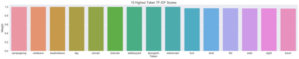
Before any machine learning algorithms cold be implemented, I had to preprocess and vectorise the tweet text: I removed URLs, punctuation, and special characters, tokenised the text by splitting at whitespaces, and rendered all tokens lowercase. The tokenised tweets were then converted into vectors that numerically represent the presence and frequency of words (tokens) in each tweet. The best vector to use is term frequency-inverse document frequency (tf-idf), as it balances the frequency of words in specific documents (tweets) against their overall frequency in the corpus—those that occur too frequently in the corpus are downscaled in weight. Thus, it highlights the most interesting and unique words: the words that should in principle define the categories of my content features. The below barplot shows the fifteen tokens with the highest tf-idf scores. It is interesting to note that six of them relate to position: voteleave, leadnotleave, remain, bremain, strongerin, voteremain.
I used the default settings provided by scikit-learn’s CountVectorizer and TfidfVectorizer for this process, and also experimented by adding a stemmer using Python’s Natural Language Toolkit (NLTK) library to reduce the number of features—stemmers collapse words that contain the same root form into the root form by removing affixes (e.g., ‘play’, ‘player’, and ‘played’ all become ‘play’). I tested three different options: Porter stemmer, Snowball stemmer, and Lancaster stemmer (the most aggressive). A more sophisticated and computationally intensive form of stemming is lemmatisation, which aims to be lexicographically accurate because it classifies tokens according to their part of speech before removing affixes (unlike a stemmer, a lemmatiser would not remove ‘s’ from ‘thus’ because it recognises that ‘thus’ is not a plural noun). As lemmatisation is not easy to incorporate into scikit-learn’s default vectorizers, I designed a custom-built preprocessing pipeline using NLTK and tested it on all of the content features as a contrast to scikit-learn. All in all, however, the significant extra time it took to implement stemmers and the NLTK preprocessor was not at all justified by the marginal increase in accuracy that they provided over the scikit-learn settings—in some cases they even decreased accuracy slightly. This is not a surprise, as tweet text is highly context-specific due to its brevity, and full of abbreviations and slang; part of speech tagging does not work very well.
Once the tweet text had been preprocessed and transformed into tf-idf vectors, I could train and test my machine learning algorithms on my hand-labelled random sample of 2,976 tweets. Training was performed on 90% of my tweets, and testing on 10% (the decisions of the algorithm were compared with my manual coding decisions to determine accuracy). I began with three basic models that are extensively used in the literature on text classification: Naïve Bayes, Linear SVC (a type of Support Vector Machine), and Logistic Regression. I then tried two advanced ensemble classifiers, Random Forest and Stochastic Gradient Boosting (Gradient Boosting Machines), but as they are extremely computationally intensive, difficult to understand, and less accurate than the best-performing basic classifier, I only implemented them for the issue feature. I also incorporated all of the classifiers into a Voting Ensemble classifier, which balances out the weaknesses of each individual model and uses a majority vote in its decisions.
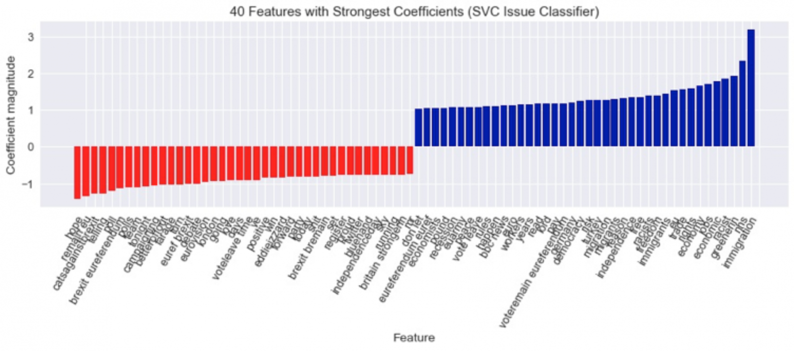
To better understand how the models were making decisions, I visualised the 40 tokens with the strongest coefficients for each model. Coefficients measure how correlated the tokens are with each category—greenerin, nhs, and immigration, for example, are the tokens with the highest coefficients for the presence of an issue for the linear SVC classifier, whereas hope, remain eu, and catsagainstbrexit correlate most strongly with no issue.
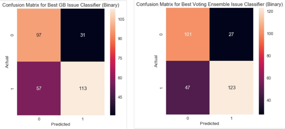
I also generated and visualised confusion matrices, which display the number of correct and incorrect classifications for each category; the matrices for the best and worst performing classifiers are below (Voting Ensemble and Gradient Boosting, respectively). The colour coding in the visualisation is useful in the assessment of the model’s accuracy: lighter colours indicate more classifications, whereas darker colours represent fewer. More accurate classifiers have light-coloured diagonal boxes, which represent correct classifications. I reviewed the misclassifications to understand why the classifiers were making mistakes. The algorithms for issue, predictably, did not work well on tweets that use metaphorical or allusive language to express themes (e.g., ‘A VOTE TO STAY IS A VOTE FOR INFINITY KEBAB’ and ‘They spread like locusts and breed like rats’ were not recognised as relating to immigration). Conversely, the algorithms misclassified tweets that have no theme as having a theme if the language is abstract—i.e., references to reasons to vote leave or remain that are made on a high level (e.g., ‘Believe in Britain #EU #brexit #referendum #voteleave’, ‘the stakes are high for every one of us’).
I refined the models by optimising their parameters using scikit-learn’s grid search. As is best practise, to avoid overfitting I performed 10-fold cross-validation both during and after grid search. Grid search only uses a subset of the training data, so I trained and tested the models with the best parameters that it produced on the entire random sample; 10-fold cross-validation means that the training and testing were performed ten times, on different splits of the data. I computed classification reports showing the average accuracies from all ten folds for each classifier. There are three different measures of accuracy: precision (the proportion of correct predictions made for a category out of all predictions made for that category), recall (the ability of the algorithm to classify all instances of a category), and F1 score, which is a balance of precision and recall. These measures are calculated for each individual category, and overall averages are also displayed. A perfect accuracy is represented by a score of 1.00. Given the fact that most of my features have imbalanced class frequencies, they are weighted by the number of true instances of each class. Although the overall average is important, what is just as—if not even more—important is the accuracy of the classifier for detecting the presence of my categories of interest (a code of 1), as opposed to the absence of the categories (a code of 0). If the overall average is high but the average for the category of interest is low, it is impractical to implement the classifier.
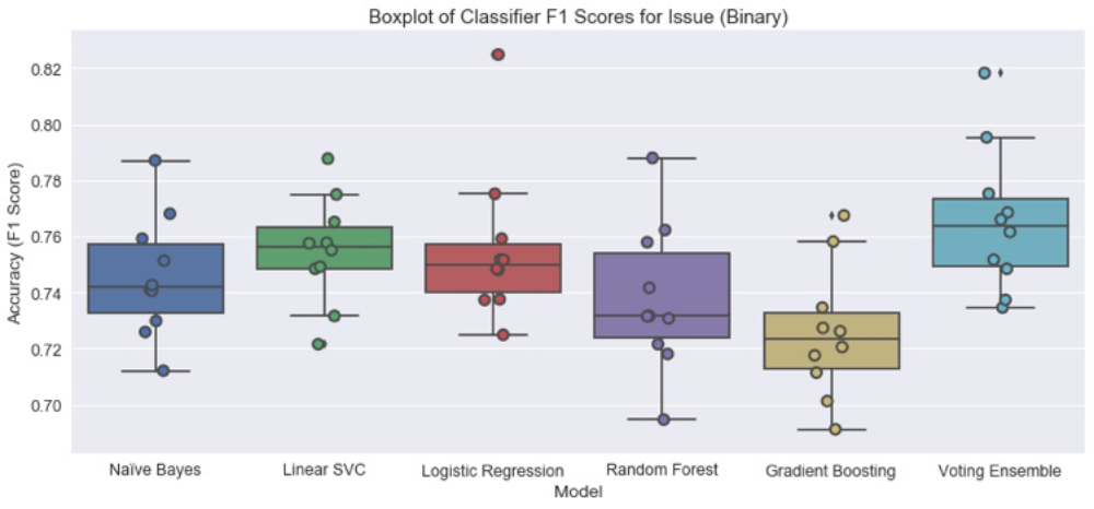
I produced barplots of the mean F1 score after 10-fold cross-validation of all of the classifiers for each feature, including the Voting Ensemble. I used this visualisation to help me assess which model (if any) to train on the entire random sample in order to predict the feature in the population from which the random sample was drawn (752,496 tweets). I ended up creating a binary version of the issue variable (0 for contains no issue, 1 for contains an issue), as accuracies for the multiclass version were not high enough; the algorithms were especially confused by the ‘none’ and ‘other’ categories. As can be seen from the barplot of F1 scores, the Voting Ensemble is the best classifier for the binary version. It has the highest median and mean F1 score: 0.77 (+/- 0.02) [95% confidence intervals: 95% of the scores fall within this range (+/- 1 standard deviation from the mean)]. Its mean F1 score for predicting issue is 0.77 as well (and both precision and recall are 0.77). This classifier was used to predict the presence of issue in the population.
The other classifiers that were implemented on the population level were those for position, emotion (binary), message type, and resolution. It should be noted that only the division category for message type can be interpreted in the models, as accuracies for identification are too low (the best F1 scores for these two categories are 0.82 and 0.58, respectively; the overall F1 score is 0.73 (+/- 0.02)). The accuracies of the message format and playfulness classifiers are also too low, but this is not a surprise given how complex and nuanced both features are—they are not defined by specific keywords, and are highly context-dependent.
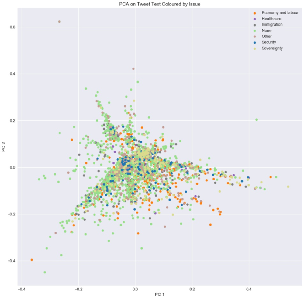
To complement and illuminate the results of the classifiers, I visualised the text of all tweets in my random sample after converting them into tf-idf vectors and reducing their dimensions. I used colour-coded scatterplots: each point represents a tweet, the x and y axes represent the two dimensions to which the tweets had been reduced, and each feature is colour coded (points representing one feature category are one colour; points representing the other category are a different colour). This allowed me to examine whether any meaningful clusters emerged that might correlate with my content feature categories, and more generally to get a sense of how complex my tweet text is. If tweets belonging to two different classes (e.g., ‘economy’ and ‘immigration’ for the issue feature) are not easily distinguishable, there is reason to believe that any text classifier would have difficulty labelling it.
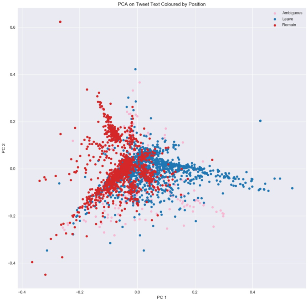
I tested three dimensionality reduction methods: truncated singular value decomposition (SVD), principal component analysis (PCA), and t-distributed Stochastic Neighbour Embedding (t-SNE). For PCA I calculated the amount of variance explained by each dimension; the higher this number is, the better (1.00 is the maximum). A higher number indicates that more information is retained by the dimensions. Given the fact that preprocessing and vectorising produced 2,243 dimensions (tokens), I was not expecting dimensionality reduction to be very effective. And indeed it was not: five principal components (dimensions) only explain 4% of the variance. A more robust application of PCA would have explained over 90% of the variance in two or three components. The colour-coded scatterplots for each content feature reveal that their categories are virtually indistinguishable from each other—there is no clear separation of the different colours (representing different categories) or even general patterns; they seem to be intermixed across the entire plot. The scatterplot for the multiclass version of issue below serves as a representative example. These are clear numerical and visual indications of the extreme complexity of tweet text.
The one exception to this is position: Leave and Remain are indeed distinguishable from each other, with more Remain points on the left side of the plot and more Leave points on the right. This makes sense because, as noted above, six of the ten tokens with the highest tf-idf scores relate to position. These tokens are most important for dimensionality reduction techniques as well as for SML classifiers: they occur with high frequency in documents, but are not as highly frequent across documents. Thus, the main dimensions used in PCA appear to encompass position-relevant keywords, and it is no coincidence that the SML classifiers for position had such high accuracies (the best classifiers had a 0.82 (+/- 0.02) mean F1 score).
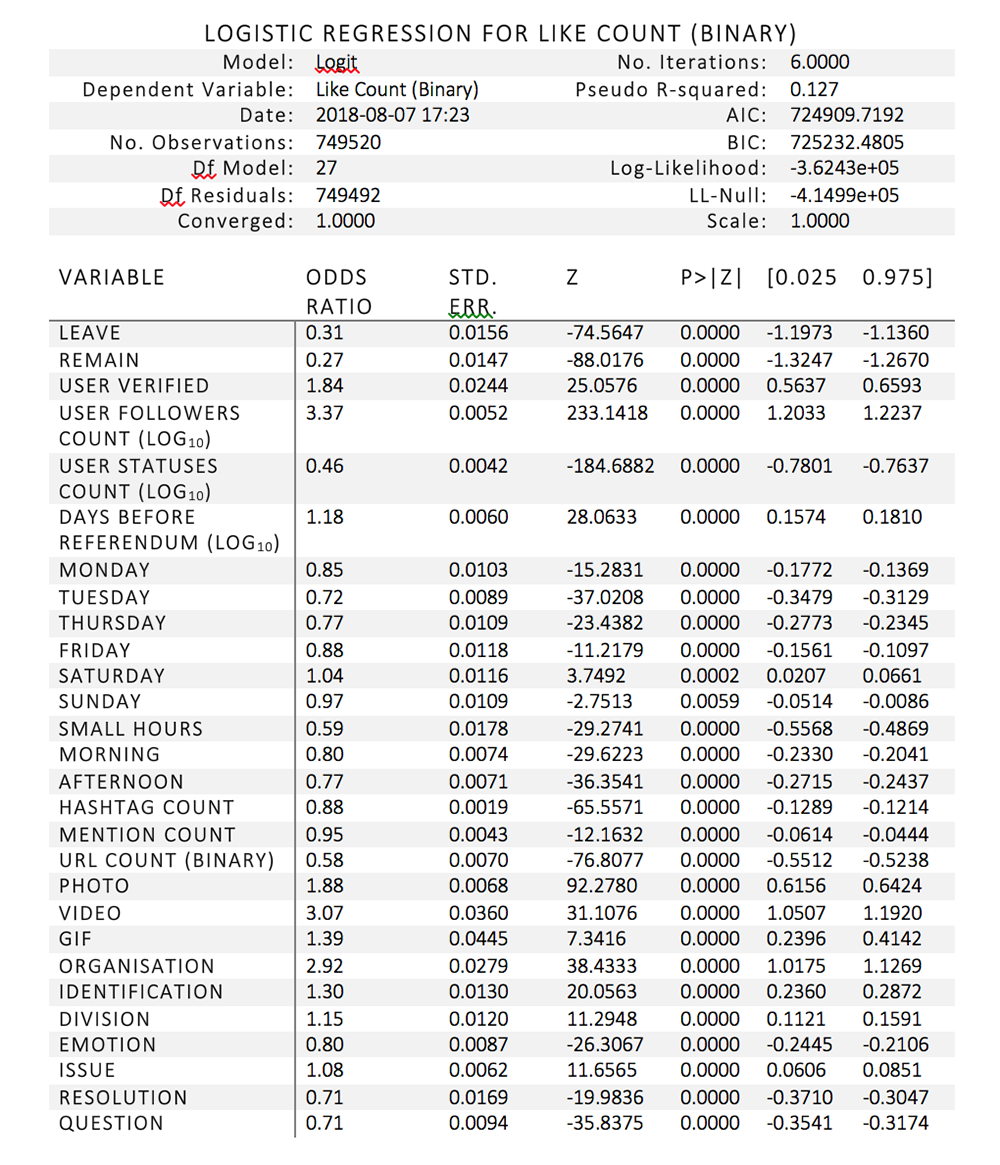
As noted above, the best performing classifiers for position, emotion (as a binary variable), message type, and resolution were trained on the entire random sample and used to label tweets in the population. All of these features except position, combined with context features (whether the user represents an organisation, whether the tweet contains a hyperlink or media item) were independent variables in my logistic regressions to assess whether content or context features are better predictors of tweet resonance, captured by retweets and likes. Position was treated as a control variable, along with the time and day of the tweet, number of days before the referendum that the tweet was published, number of tweets the user had previously published, and number of followers of the user. Logistic regression was chosen as opposed to linear because of the extreme right skew of the dependent variables: 62.78% of tweets in the population received no retweets, and 75.77% received no likes. Thus, success cannot be conceived of as virality; even getting one share or like can be considered as resonance (compared to the average tweet).
Full results are in the two tables below. As expected, due to the fact that 749,520 tweets are in the population dataset (the 2,976 tweets in the random sample were removed as they were used to train the text classifiers), almost every variable is extremely statistically significant, with p values of less than 0.0001. In the retweet regression, the only two variables that are not significant are mentions count (p = 0.9765) and Saturday (p = 0.7251). In the like regression, all variables are statistically significant. Thus, only differences in odds ratios can be interpreted. The reference categories (variables left out of the regression) are ‘ambiguous’ (for position), ‘Wednesday’ (for day of the week), ‘night’ (for time of day), and ‘other’ (for message type). These categories are either modal or less theoretically interesting.
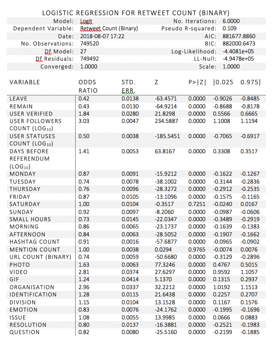
The control variable that is most strongly associated with retweet count is user followers count: for every log10 increase in follower count, the odds of a retweet being received increase by 203%—i.e., they more than double, holding all other variables constant. This is not at all a surprise, as the number of followers represents the size of the audience of a tweet: the number of users to whom the tweet is exposed. Even the most brilliantly crafted tweet might not be shared at all if the user who sends it has next to no followers.
Of the independent variables, the two with the strongest effect on whether a tweet is shared are organisation (whether the sender represents an organisation) and the inclusion of a visual item. Being sent from an organisational account in and of itself almost doubles the odds of a tweet being shared (an increase of 196% compared to tweets not from organisations). Of the three types of visual items, videos have the strongest effect—the inclusion of a video in a tweet increases its odds of being shared by 181%. Photo has the second strongest effect, represented by an odds increase of 63%.
As a contrast to these two context variables, content variables do not have strong effects. The two that increase the odds of a tweet being shared are division and issue (nothing conclusive can be said about identification, as the classifier was not accurate enough for this category). If a tweet includes divisive rhetoric, its odds of being retweeted increase by 15% compared with a tweet that includes ambiguous rhetoric. The effect is also positive but even weaker for issue: if a tweet contains a substantive theme (e.g., economy, immigration, sovereignty), its odds of being shared increase by 8%.
The other three content features included in the model actually decrease the likelihood of a retweet, and also have relatively weak effects. The greatest of these effects is represented by resolution—the inclusion of a call to action in a tweet decreases retweet odds by 20%. The other two features are question and emotion (the inclusion of enthusiasm, anxiety, and/or aversion): they decrease retweet odds by 18% and 17%, respectively.
As with retweet count, the control variable that is most strongly and positively associated with like count is user followers count: for every log10 increase in follower count, the odds of a retweet being received increase by 237%. Interestingly, position has a strong negative effect: tweets that explicitly express support for Leave or Remain are far less likely to be retweeted than tweets that are ambiguous. The odds decrease by 69% and 73%, respectively.
The effects of the other independent variables in the like model are very similar to those in the retweet model. Organisation and the inclusion of a visual item are the variables with the strongest effect; the odds of receiving a like increase by 207% if the tweet contains a video, 88% if the tweet contains a photo, and 192% if the tweet is from an organisation. Division and issue both have the same weak positive effects that they do in the retweet model: the odds of a tweet being liked increase by 15% if it includes division, and 8% if it includes a substantive issue. Conversely, emotion, resolution, and question decrease the odds of a tweet being liked: by 20% for emotion, and 29% for both resolution and question. The strength of the effect of emotion is comparable to that in the retweet model, and the negative effects of question and resolution are slightly stronger.
All in all, these results reflect the fact that content does not matter very much—even if expressed with flair, humour, or strong emotions. What does matter is visually arresting attention: including a video or an image in the message. In more statistical terms, context explains far more variance in whether a tweet is liked or shared.
Moreover, institutional users have a competitive advantage—their tweets are far more likely to resonate regardless of visual content. Thus, my results indicate that new media reinforces power structures in old media; politicians, journalists, and leaders of organisations are as dominant on Twitter as they are in newspaper headlines, despite the vast literature on the democratisation potential of social media.
All is, however, not lost for non-institutions. A unique minority of users who do not have institutional support manage to become extremely influential on social media. New theory is required to understand why they are so successful, and my qualitative analysis of outliers and interview data (which is outside the scope of this blog post!) will contribute empirical evidence for such a theory.
I cannot comment on the impact of Twitter on the referendum result, as Twitter users are not representative of the UK population. However, it is significant that many users who tweeted about the referendum had Brexit-related usernames, descriptions, or photos. This indicates a higher than usual degree of engagement with a political event. It is also important to note that journalists love Twitter. Tweets achieve prominence when they are quoted in the media; sometimes news articles are written about trending hashtags (#CatsAgainstBrexit is an excellent example). If the virality was orchestrated, news coverage can be skewed—which might affect popular opinion.