
Visualizing the Results of Biclustering and Boolean Matrix Factorization Algorithms
In many data science tasks our goal is to understand the relationship of two different sets of entities. For example, a common problem that online shops need to solve is to understand the relationship between customers and products. This relationship reveals clusters of products that are frequently bought together and groups of users who buy similar products. Such insights can then be used for marketing activities or to make product recommendations.
This problem is often modelled using bipartite graphs where the two sides of the bipartite graph correspond to the two sets of different entities. An edge indicates that two entities interact with each other (e.g., a customer has bought a certain product). Then the goal is to find dense areas or clusters in this graph since the clusters reveal groups of entities that are related. This problem has applications in numerous fields [1][2][3].
Since nowadays the input datasets are very large, we cannot manually find such clusters. Therefore, automatic clustering algorithms were conceived and have been an active research area for decades [4][5][6]. However, using these algorithms can have drawbacks. First, the computed clusters are typically returned as a list of entities. This makes the analysis by a human difficult, since these lists do not reveal how strong the interactions are. Next, many of these algorithms need a set of parameters and often it is not clear how these parameters should be set for the data at hand. Finally, the computed clusters might overlap with each other by sharing entities, which complicates the interpretation of the results.
To mitigate these drawbacks we develop novel visualization tools and algorithms for drawing the outputs of clustering algorithms. Thereby we make the output of clustering algorithms more accessible and enable practitioners to use domain knowledge to assert the validity of a given clustering.
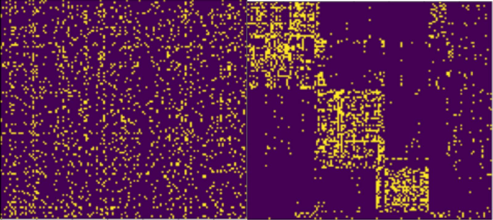
Figure 1. Visualization of an unordered matrix (left) and the same matrix after running a clustering algorithm and reordering the rows and columns based on the clustering (right).
In our visualization we decide to draw the (bi-)adjacency matrix of the bipartite graph. Since the clusters represent dense subgraphs within the bipartite graph, each cluster will induce a dense area of 1-entries in the adjacency matrix as can be seen in Figure 1. Therefore, analysts will be able to quickly understand the cluster structure of their data.
We propose an algorithm that, given a bipartite graph and a clustering of the graph, finds a suitable visualization of the adjacency matrix of the graph. Our approach is different from previous methods, which are unable to visualize a given graph clustering.
To obtain a good visualization of the clustering we need to reorder the rows and the columns of the adjacency matrix based on the clustering. The choice of this ordering will have a large impact on how the clusters appear in the picture. Our main difficulty will be when the clusters returned by the clustering algorithm overlap, i.e., when the same entity appears in multiple clusters. To deal with this issue, we propose an objective function that generalizes to the overlapping setting and incentivizes orderings in which each cluster is drawn as a consecutive rectangle of 1-entries. We also provide algorithms to optimize this objective function.
By using our method, we obtain an intuitive way to compare the output of two different clustering algorithms. In Figure 2 we visualize the clusterings obtained from two different algorithms on the same dataset. The database used to obtain these figures is the Neogene of the Old World (NOW) database [3], which shows the relation between mammal fossil records and fossil localities in Europe.
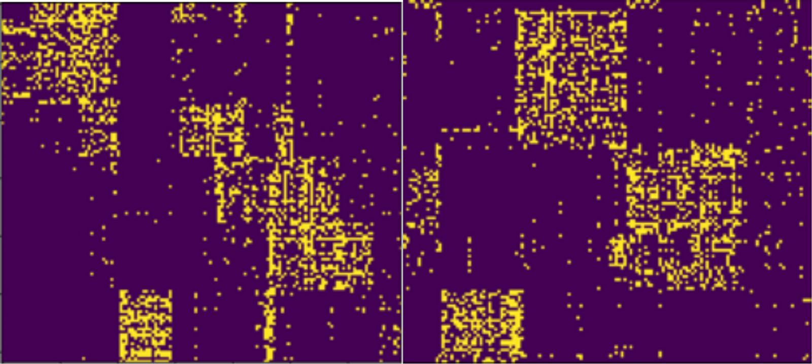
Figure 2. Visualization of two different clusterings of the same dataset.
The picture visualizes the clustering results obtained from the PCV algorithm [5] (left) and the Basso algorithm [6] (right).
Indeed, the left clustering in Figure 2 seems to describe many small clusters, whereas the clustering on the right of Figure 2 describes larger clusters, with less noise outside of the clusters. Thus, it appears like the clustering on the left overfits the data and the clustering on the right fits the data better. These insights can be used by analysts to refine the clustering, either by manually changing the clustering or by adjusting the parameters of the algorithms to obtain better results.
Additionally, in Figure 3 we present the visualization of a larger dataset before and after applying our algorithms. We can see that the dataset contains a strong cluster structure. Furthermore, we observe that some of the clusters are more dense than others, which can be important information for analysts to judge how strong the relations between the entities are.
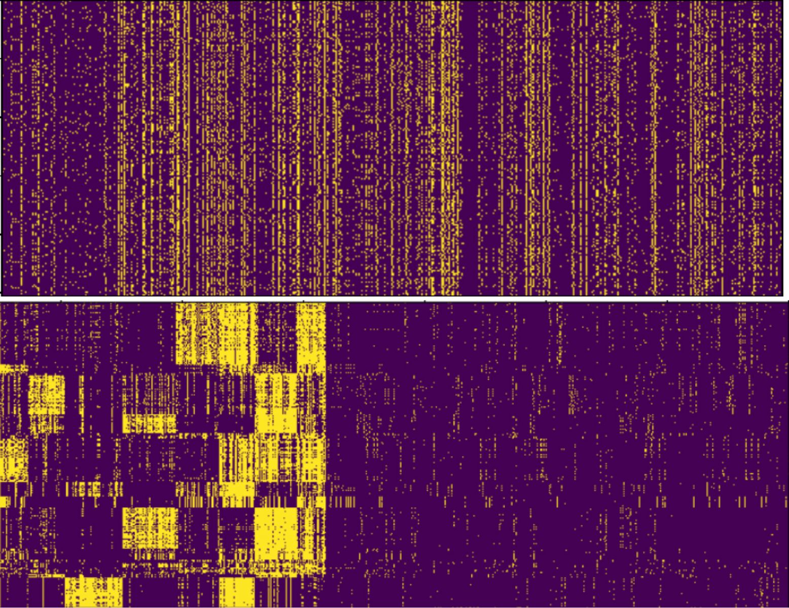
Figure 3. Visualization of a dataset before reordering (top) and after reordering (bottom). The dataset represents Finnish dialects and the regions they appear in.
The visualization enables us to detect sparse and dense regions in the clustering.
In conclusion, we have presented algorithms that allow us to efficiently visualize the results of clustering algorithms. Our methods can be used to evaluate how each clustering shapes the data and it can enable analysts to assess how well a given clustering better describes the relationships within the data.
Written by: Thibault Marette
References
[1] Kemal Eren, Mehmet Deveci, Onur Küçüktunç, and Ümit V Çatalyürek. A comparativeanalysis of biclustering algorithms for gene expression data. Briefings in Bioinformatics, 14(3):279–292, 2013.
[2] David B Allison, Xiangqin Cui, Grier P Page, and Mahyar Sabripour. Microarray dataanalysis: from disarray to consolidation and consensus. Nature Reviews Genetics, 7(1):55–65, 2006.
[3] M Fortelius. New and Old Worlds Database of Fossil Mammals (NOW). 2015.
[4] John A. Hartigan. “Direct Clustering of a Data Matrix”. In: Journal of the American Statistical Association, 67.337 (1972), pp. 123–129.
[5] Stefan Neumann. Bipartite stochastic block models with tiny clusters. Conference on Neural Information Processing Systems, pp. 3871–3881, 2018.
[6] Pauli Miettinen, Taneli Mielikäinen, Aristides Gionis, Gautam Das, and Heikki Mannila. Thediscrete basis problem. IEEE Transactions on Knowledge and Data Engineering, 20(10):1348–1362, 2008.