
The world news tells us about peace
Previous research (recently published in EPJ Data Science) demonstrates that the official Global Peace Index (GPI) [1] can be captured at a higher frequency through GDELT [2], a digital news database. Undoubtedly, digital data harnessed with AI tools contribute to advances in well-being studies, including peace. Together with the unprecedented advantages, digital data is characterized by important challenges. One of the most crucial is to ensure that the information produced is properly decoded for the audience in interest, such as, in our research, policy-makers, and non-governmental organizations.
Therefore, we created a dashboard which synthesizes the most crucial information for the policy-makers and peace-keepers, avoiding complicated academic data visualization, and thus minimizing the cognitive load. The link to the dashboard can be found here. Telling the story of our results produced through this dashboard aims to maintain the messages clear and coherent, providing time for processing and reflection, with the use of specific examples.
In particular, in our dashboard, a user can choose to explore a country’s peace for a particular month. Figure 1 presents the example of Brazil for September 2019 (the square bullet point is colored in dark gray). On the left side of Figure 1 there is the the map. The country selected, Brazil, is colored in dark gray. In September 2019 the predicted GPI is 2.228 and the real GPI is 2.342. On the right side of Figure 1 there is the plot depicting the real versus the predicted GPI for all dates. On the yellow area of the plot, the user is informed for the predicted GPI for the dates since the real GPI is not available yet.
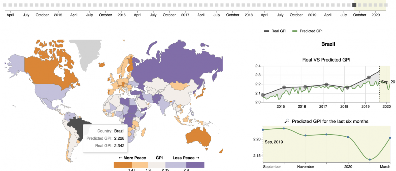
Fig. 1: The example of Brazil on the dashboard; the GPI predictions.
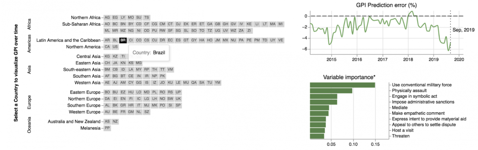
Fig. 2: The example of Brazil on the dashboard; prediction error and variable importance.
Lastly, the dashboard provides the user with all the information which might be useful. For example, the github repository for code reproducibility, the most important references of the study, as well as answers for a list of frequently asked questions, such as where the scientific papers can be found.
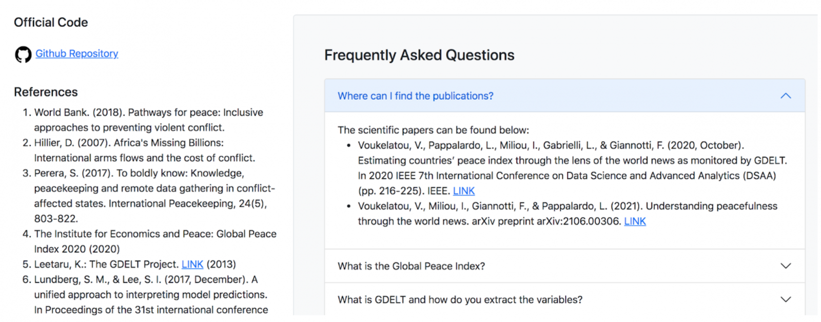
Fig. 3: Additional information on the dashboard.
References:
[1] The Institute for Economics and Peace, “VISION of HUMANITY.” http://visionofhumanity.org//, 2017.
[2] Leetaru, K., & Schrodt, P. A. (2013, April). Gdelt: Global data on events, location, and tone, 1979–2012. In ISA annual convention (Vol. 2, No. 4, pp. 1-49). Citeseer.